Infuse Emotional Intelligence With UX Design for Success
Propelrr
February 15, 2023Keen emotional intelligence in user experience (UX) design is invaluable.
When you think of websites, how huge of consideration is user experience or UX design in it? Is it one of your top priorities or does it trail behind other flashy and often unnecessary functionalities?
Considering the usual budget businesses allot for digitalization, many often knock it down to the bottom. Fair enough. But with our experience as digital marketing agency in web design and development, it’s much better to make it one of – if not the top-most – priority of your build requirements.
Emotions, UX design, and digital marketing
Emotions play a huge part in our lives, simply for the fact that they are the reason behind most of our decisions. From what you choose to do after a tiring day at work, to even what you choose to add to your cart during payday sales.
And be it subconsciously or consciously, you know that your recent purchase was driven by a feeling you had at the moment. For a business, this certainly sounds like something you can leverage. Especially when the digital age allows you to now reach more customers than ever.
Way back when people only came online to communicate. Now, more people are coming online to shop, too. A boom in consumption that continues your consumer’s views and values surrounding purchasing goods. More than ever, your customers are viewing and purchasing products for reasons other than their intended purposes.
Products don’t merely just serve a function; it is also necessary to spark strong, positive emotions in users’ minds. And the best way to harness this is through design.
Allow us to walk you through a more detailed explanation of why and how you should inject emotional intelligence into your UX designs for websites.
Emotional intelligence matters in UX design because…
We are designing for people – for their ultimate experience and to engage them. Hence, it’s critical to think about who your potential customers are and how your brand website experience affects them.
In more specific ways, emotionally intelligent design helps your brand:
- Ultimately, emotionally intelligent designs drive conversions. The design of a website actually raises or reduces the engagement rate and, whether it provides time-dependent terms or places a temporary call, it takes into account a call to action (CTA) and a higher level of commitment.
- You connect easily with the users. When it comes to building relationships and lifelong relations with customers, emotions often prevail because they last longer and create positivity, which affects their feelings and helps them become more attached to the company.
- Foster consumer trust toward your brand. A key element of emotional intelligence is empathy. With the ability to put yourself in the user’s situation, you can easily identify pain points that need to be addressed in the design and disarm customers’ hesitations or reservations over completing a desired action. Put simply, you get to reduce friction in the process. This leads not only to positive figures in the website performance but, more importantly, stronger brand credibility.
- Serve your customers better. With emotional intelligence, you’ll be able to anticipate whether your customers are inclined to scroll instead of swipe, for example. Aligning the website features with your customers’ expectations translate to a more intuitive experience. This should form part of your design approach priorities.
- Retain more customers. As you design with the needs and interests of the users in mind, you create experiences that also trigger positive memories. In the long run, it prompts people to go back to your website and feel the same emotions while reading through a blog or buying a product. Customer retention not only boosts your return on investment (ROI), but more importantly, brings in new customers as your returning customers advocate for your brand to their peers.
- Hook audiences and reduce bounce rates. We fall behind in the marketing race if we don’t measure the statistical data in UX design. Successful emotional design means a lower bounce rate, which is the optimal outcome for UX design. UX design provides us with resources that structuralize the website with excellent user-friendly tools in such a way that it offers the user a quality navigation experience.
- Carve out a niche for your brand. Without a question, a well-designed interface will enhance or detract from the appeal of your brand. This feel-good aspect is responsible for getting customers back to your website, as well as generating free word-of-mouth advertising for your brand, resulting in increased revenue and market value.
- Maintain the integrity of the design. If a designer puts their heart into the concept creation stage, they would be in a stronger position to retain their uniqueness and website values by forming a special relationship with their clients. A fantastic product is also adaptable, which speaks volumes for the designers’ attention to detail in their design — this should be one of the biggest considerations in your website design checklist.
- Sustain your competitive advantage. Good emotional design brings fantastic development to the industry and lifts you up into the marketplace by giving you a loyal client base. With their sleek, practical, and slicker styles, companies have outshined their competitors in the industry race. As a result, you’ll have a competitive advantage in the industry.
To implement emotional intelligence in your UX design projects and experience the benefits above, we’ll now look into some concepts you can use to build your designs.
Don Norman’s three levels of design
Whether you’re just laying out your first UX design project or you’re in your 50th design plan, your design must perform exceptionally well on three levels to produce an emotionally intuitive experience.
These are visceral, behavioral, and reflective based on UX research and the University of California The Design Lab Director Donald (Don) Norman’s proposed theory of emotional systems. We elaborate on each of these levels, below.
- Visceral. This level concerns the unconscious and automatic aspects of human emotion. At this level, the superficial characteristics of a product are enough for it to stand out from competitors’. In terms of your UX designs, your priority here is giving customers a clear and straightforward understanding of your products and services to compel a quick response.
- Behavioral. This level is concerned with what we know as usability which involves the user interface and technical features of a framework for the UX design. Here, user research is vital; your interface and navigation should assimilate the presumed transaction behavior of your users and enable them to complete goals with the least amount of effort or friction.
- Reflective. This is the highest degree of emotional design, and it considers the users’ conscious feelings and their decision-making process. It’s the only level that uses conscious processing, but it’s inspired heavily by the others. The stronger the emotional design, the more likely the consumer can form a bond with it and arrive at decisions faster.
Admittedly, the theory sounds cerebral and complicated. After all, there are so many factors about human behavior and how they interact with technology to consider.
To help UX design teams work in a focused and clear manner, we develop what is the equivalent of a blueprint called the user journey map in UX.
The user journey map in UX
Quick review: We know that UX design prioritizes the user as we design for and with them in mind. We also know that there are a number of considerations that can make the process quite complicated. And that, these combined, can lead to a lot of confusion during the design process.
To help your teams work effectively and stay focused, creating a user journey map is recommended.
What a user journey map essentially looks like is a map – like a mind map – of how your users are expected to interact with features on a website or application to achieve goals. Note that there are no standards for creating these maps as no one industry, company process, and customer are alike. They are similar, but they can’t all think and operate the same way.
But with the help of meticulous research and a well-crafted user story, you can carve out clear paths for your user journey map that targets your ideal audience.
READ ALSO: 5-step Guide on How to Write User Stories for Mobile Apps
Let’s look at a sample user journey map for a UX design of an app created for a local condominium that’s offering shuttle services for its tenants. The goal is to help them book shuttle transfers to and from popular destinations in the specific condominium’s location:
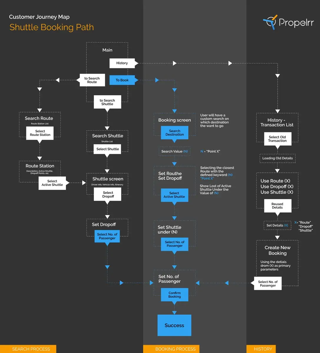
BOOKING JOURNEY. Though it looks simple, this user journey map was created from meticulous user research and from the development of user personas and stories. Photo by Propelrr.
Integrating emotional intelligence into UX design
According to the book ‘Emotional Design Elements’ by Smashing Magazine, these psychological factors can induce positive emotions:
- Positivity
- Surprise
- Uniqueness
- Attention
- Attraction
- Anticipation
- Exclusivity
- Responsiveness
By considering these factors, we will have a great chance to get the desired emotional response from our users. But of course, we can’t always get a positive response since we all differ in personality and attitude.
One technique we can use is to add User Interaction to our web or mobile apps. By doing so, we are giving our apps the soul it needs, or what we sometimes call the personality, making it more engaging to the users. These interactions can come in any form or element. It could be the message of the content, the graphics or images used, an output action, or a simple animation.
1. Being creatively lost and clever.
If the data the user is looking for cannot be found, instead of just displaying an error message that can make the user more frustrated, we can also show some recommendations or be creative with the message by making it more fun in a way.
2. Simplified tutor.
Another example is providing walkthroughs for first-time users of the app; it makes it more convenient for users. It’s as if someone is actually teaching them where to start and what to do next.
3. Interact and impress.
When competing for attention, you cannot stand behind anyone. You should be standing above them. The key? Interact and impress. Here are some examples of how you can apply human interactions when developing your mobile application:
These animated transitions make it more fun and engaging for the users. It makes them curious about what your mobile application can do next as an output when they do something. Gamifying your app makes it an enjoyable experience users cannot forget.
4. Don’t emote with weird kinks.
Another technique we can use is by mimicking human emotions. The simplest act of adding a human element is enough to get your audience’s sentiment.
How would you feel seeing an image of a poor boy begging at a website’s header? And how would you feel seeing an image of a hot model smiling? Got my point? You should, by now.
5. Classic taste and habitue style.
Going minimalist is also a technique some designers use. This technique, however, is more straight to the point or sophisticated in a way. It’s tricky how designers juggle a combination of flat color palettes, large images, and typography to convey the message.
But just because it’s clean and simple means it’s already missing the “Wow!” factor. You’ll be surprised what a minimal design can do, once you get to know it.
It plays around with transition, parallax scrolling, and hover effects. Check this site, for example, and you’ll find out what a minimal site can do.
6. UX heuristic analysis.
Heuristic analysis, the expert review of the interface design using usability principles, is critical in ensuring that you’ll be able to promote the right, desired emotions in your website design.
One of the techniques we follow at Propelrr involves looking at the seven levers of conversion or the psychological triggers that inspire people to take action. We assess how optimized conversion-specific pages are with these levers as our lens.
In a nutshell, during a heuristic analysis, you’re asking the question, “Is the website really easy to use?” By having subject matter experts evaluate the interface design, you get to remove your own biases in the evaluation process and really get an objective review of the platform.
The experts will be able to pinpoint which elements are confusing, annoying, or boring to your visitors, and as a result, you’ll be able to make the necessary adjustments. For this reason, incorporate heuristic analysis in your web development workflow, as part of jumpstarting your UX design project.
7. Neuromarketing.
Neuromarketing refers to the application of brain science to the business of promoting products and services. It largely involves tapping into people’s irrational and emotional needs.
According to consumer psychologists, there are two systems in the brain: system one, the subconscious, which processes emotions, and system two, which makes rational logical decisions. The former is called the reptilian brain because of its primitive thinking. You need to appeal to both, but especially to the reptilian brain.
People default to the reptilian brain because it’s less taxing and exhausting than system two. This is why it’s important to appeal to system one, people’s irrational, emotional needs when creating your interface design.
Visual elements, such as colors and images, are extremely instrumental in eliciting emotions and eliminating rational thinking. Think about it, how many times have you ordered a meal in the middle of the night, simply because you scrolled past a juicy burger ad? This same impulse can be achieved with emotional UI, even for creating effective lead-generation forms.
These are just a few of the techniques that we can use to improve our design. Remember that the goal here is to convince users that your app or site is worth using or buying. But the real challenge after that layer is user retention. How do you keep them coming back to your site or how to keep them satisfied using your app?
Key takeaways
The design trend is always changing, which means we also need to upgrade and iterate our designs from time to time to cope with the users’ needs. That’s why they say design is a never-ending process.
- Consider your users’ needs before delivering content— do they need copies? Is a video better? Are they keen on graphics? Know who they are and what they’re looking for.
- Instead of text, try using graphics, but don’t overuse illustration because it will lose its effects.
- Have multiple people with different backgrounds test your design. The more insight and comments, the better you can improve the experience.
Got any comments or questions on promoting brand awareness? We’d love to hear your thoughts. Talk to the Propelrr team over at our Facebook, X, or LinkedIn accounts.
For more tips on how you can inject more emotional intelligence into your UX designs, make sure to subscribe to the Propelrr newsletter.